I'm working on upgrading my understanding of computer graphics, and this issue has totally stumped me.
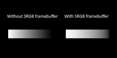
I'm 99.9% sure I've got Linear -> sRGB happening correctly in my renderer. As shown by the difference in the gradients in the gradient image. Gradients which are "perceptually linear" come from interpolating white >>> black in non-linear sRGB space, which is done by the example on the left in all the images ("without srgb framebuffer" in opengl terms actually means there is no color space conversion which means it's all in sRGB - kind of confusing)
I'm 95% sure that blends for anti-aliasing should be done in linear color space with pixel coverage being exactly equal to the blend factor. No other interpretation makes sense conceptually. There's no way blending should be in any other color space. And the theoretically correct value of a pixel to be a blend w_1*c_1 + w_2*c_2 + ... w_n*c_n for a pixel with n colors c_i with the corresponding w_i giving the proportion 0 <= w_i <= 1 of the pixel covered by that color (at least given simple box filtering antialiasing as the baseline assumption). And so those weights really should sum to 1 w_1 + w_2 + ... w_n = 1 so that, for instance, if you have several nearly white colors blended, your result will not become a lot darker. Which brings me to the conclusion "pixel coverage exactly equals the blend factor" (-- the only reason this is at 95% and not higher is that maybe the simple box filtering model is the problem here, but I'm pretty sure that should give very reasonable results which makes the next bit pretty confusing)
I'm about 85% sure that the circles in the image attached look better when I was doing the blending naively (i.e. in sRGB space) instead of doing the blending in linear space. This is more aesthetic though, so feedback on this part would be nice:

So the big question is: how is this resolved? All of the conclusions above seem pretty solid, and I haven't been able to find any holes in them, but they also can't all be true at the same time. Or can they? Is it that I have a wrong piece in this puzzle, or is it that the pieces actually fit together if I arrange them with each other a little differently?
Any help would be appreciated!
I can't help you much, but for the images with the circles, the circles on the left looked more like circles. It's more visible on the small circles, the white small circle looks a bit like a rounded rectangle. But the differences where not obvious at first look.
Be wary of letting optical illusions fool you into doing the wrong thing. I wasted some time trying to "fix" the blending in a font renderer because I noticed that black-on-white text looked significantly thinner than white-on-black text. This font blending test plate shows the effect:

Turns out the blending was correct the whole time, and I was just observing the irradiance illusion, which typographers have known about since long before computers ever existed. So with correct blending, the white circles in your image should actually appear slightly larger than the black ones, as they do on the right.
I would also tend to suspect that the circles looking rectangular might be an optical illusion. I remember reading somewhere (I don't remember where, but I think it was in an article or paper on pixel density in VR displays) that the human visual system is very sensitive to sharp high-contrast edges, and can discern differences in position and orientation of a high-contrast straight line down to a small fraction of the width of a single cone cell in the retina.
So you may be picking up on the fact that the top, bottom, left, and right edges of a rasterized circle create an edge (as they should) and perceiving that part as a sharp, straight line, while perceiving the rest of the figure as a slightly fuzzier circle. Hence you see 4 straight lines connected by quadrants of a circle, i.e. a rounded rectangle.
If my theory is correct, then the illusion is probably exaggerated by the fact that the bounding box of these circles is aligned with the pixel grid, which creates the longest and highest-contrast pixel edges possible. I'd suggest looking at non-pixel-grid-aligned circles as well, and my hypothesis is they won't look as much like rounded rectangles.
(By the way, there should be one dark grey square and three light grey squares of equal brightness in the middle of that test plate image. If there are three dark squares and one light square, then it's getting resized in SRGB space - you'll need to view it in its original resolution to see it properly. And if the three light squares aren't all the same brightness when viewed at their original resolution, then your screen isn't color calibrated correctly.)
Edited by Miles
on
As it turns out, I did need to calibrate my monitor. I did not realize this before but monitor calibration can make such a big difference in how things look that it was making the "correct" circles in my test image appear more aliased because of how bright the grays were.
It took me a while to get there because I went through and very thoroughly checked a lot of other things before I tried this one. It was a slow process but I learned a lot and compiled all the research into this video if anyone else would like to understand this issue better: