Hi,
Lately I've been working on tools development on my new company: raylib technologies.
All tools have a GUI but most of them are primary intended to work from command line to process data, so, I was investigating "standard" command line designs.
Surprisingly, there is not a clear standard and lots of command lines out there are difficult to read and understand, not to mention that most GUI tools lack a proper command line. I analyzed several tools, in my opinion, with a quite good CLI, to design my own standard for my tools suite.
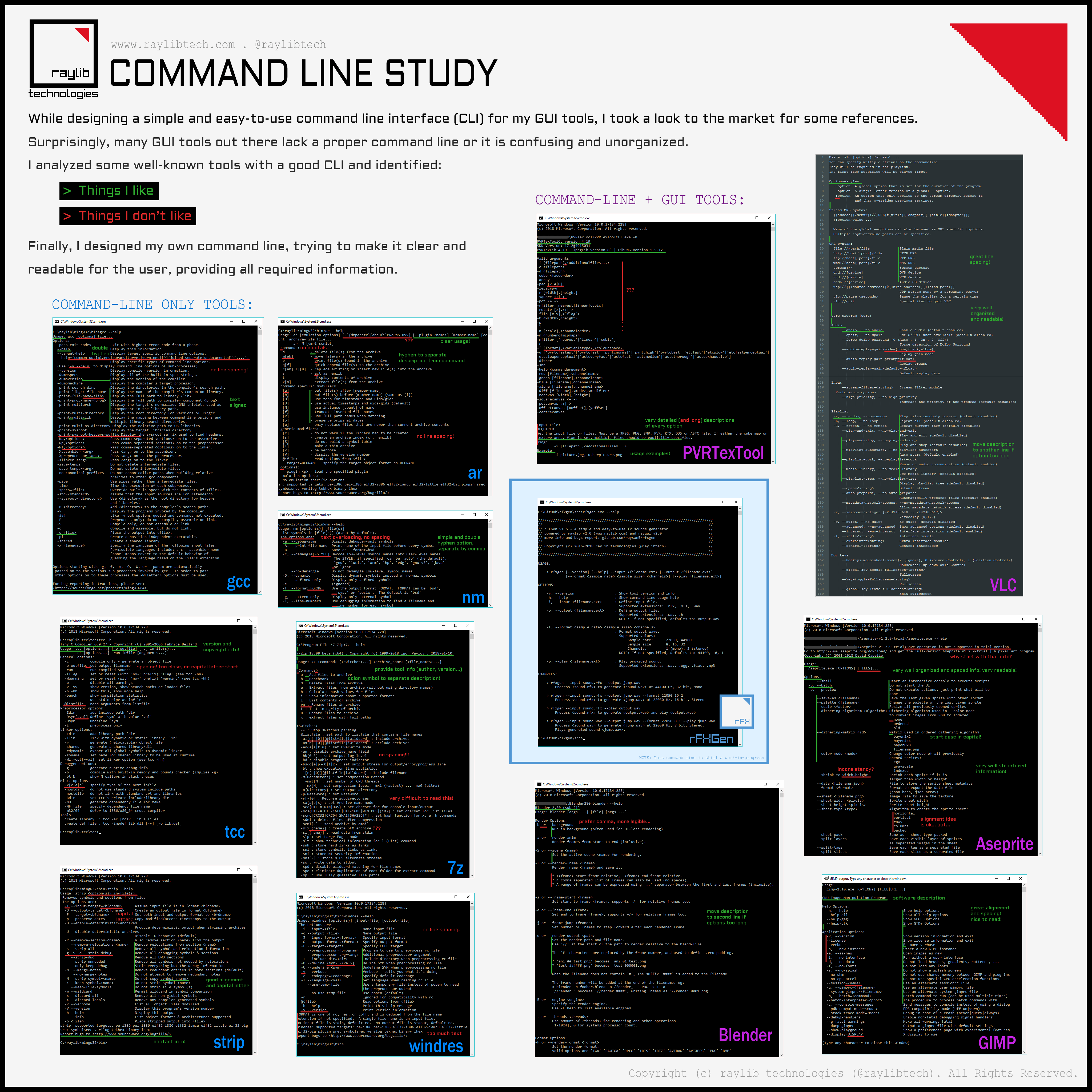
I focused on arguments-options-parameters passing style but also information organization when shown to the user (spacing, indentation...). Here it is an infography with my investigation:

rFXGen tool is my testing tool for command line implementation.
There are some things that still do not convince me, like the parameters passing for --format option:
Any feedback on command line design is very welcome!
Lately I've been working on tools development on my new company: raylib technologies.
All tools have a GUI but most of them are primary intended to work from command line to process data, so, I was investigating "standard" command line designs.
Surprisingly, there is not a clear standard and lots of command lines out there are difficult to read and understand, not to mention that most GUI tools lack a proper command line. I analyzed several tools, in my opinion, with a quite good CLI, to design my own standard for my tools suite.
I focused on arguments-options-parameters passing style but also information organization when shown to the user (spacing, indentation...). Here it is an infography with my investigation:

rFXGen tool is my testing tool for command line implementation.
There are some things that still do not convince me, like the parameters passing for --format option:
1 2 | -f, --format <sample_rate> <sample_size> <channels>
: Format output wave.
|
Any feedback on command line design is very welcome!
Edited by Ray
on
Hello Ray,
I remember RAD video tools for having a pretty explicit command line help. Their choice of writing it in a dialog box instead of the command line itself can be argued, especially when you are explicitly launching it from the command line, but it has the advantage of not quitting instantly when you double-click the executable (if you don't know it's a command line tool yet) (That can be achieved with "PAUSE" under windows anyway). But the actual text is pretty helpful and consistent.
Regarding your design, I like it :) If I were you, I would get rid of all the ">" (They're confusing to me - maybe just to me? - because ">" already has a meaning on the command line, and your alignment already does a good job of telling the difference between examples/options and descriptions!)
Hi Guntha!
Thanks for the reference to RAD tools, I checked them and CLI it's quite good also, they seem to mix it with some GUI options, interesting... Personally, I prefer the double iphem -- style for options instead of the /X Windows style. Also prefer the pure command line mode instead of the windows info panel.
In my case, all my tools have a GUI, so, if opened with a double click or by one-file drag&drop, GUI mode opens automatically.
Thanks for the feedback on > symbol... personally I like it, let's see what other people think about it.
Most open-source cli utilities targeting Linux have good CLI in my opinion.
For me this means:
1) short and long options: -i vs --input
2) combining short options together: -ixu is same as -i -x -u
3) order of arguments is not relevant.
4) ability to specify value after argument delimited either with space or equal: --name=value vs --name value
5) supporting -- in cases where arbitrary string needs to be passed as value, so it can include - or -- in it.
6) preferably supporting "response files" - @file.txt will make it read arguments from file.txt. Mostly useful on Windows which has limitation on how long command-line can be (8192 for cmd.exe, 32767 for CreateProcess).
Most of these come from fact that they use getopt or argparse in Python.
llvm/clang has pretty cool system for arguments, their parsing and displaying help. Although it is pretty heavy C++.
I can live fine with few misaligned lines in --help output :)
Edited by Mārtiņš Možeiko
on
I don't like the big header at the top. It contains information that I would not search for in the help. I would rather display them in a --description option or something like that. More specifically the version number and description are OK for me in the help, the rest isn't. I like console output to be small so I can still see what was before in the console in case it was relevant for why I looked at the help.
The > at the beginning of lines seem unnecessary to me too, as well as the : in front of the descriptions.
Why does -f and -p have a blank line above ?
Did you have "rules" or do you just try things until it looks good ?
The > at the beginning of lines seem unnecessary to me too, as well as the : in front of the descriptions.
Why does -f and -p have a blank line above ?
Did you have "rules" or do you just try things until it looks good ?
Edited by Simon Anciaux
on
Reason: typo
mmozeiko, mrmixer, thank you very much for the feedback!
mmozeiko, I actually followed some of the common Linux CLI rules. I'm not usign getopt or argparse, I'm just parsing the command-line by myself.
mrmixer, personally I like the header at the top but I know it's not common in most CLI tools... -f and -p have blank spaces to separate the information from some previous NOTES. I added for better readability.
Well, doesn't seem to be standard rules out there so I defined my own rules checking what other tools do that I liked. And yes, I tried until I find I formula that looks good.
mmozeiko, I actually followed some of the common Linux CLI rules. I'm not usign getopt or argparse, I'm just parsing the command-line by myself.
mrmixer, personally I like the header at the top but I know it's not common in most CLI tools... -f and -p have blank spaces to separate the information from some previous NOTES. I added for better readability.
mrmixer
Did you have "rules" or do you just try things until it looks good?
Well, doesn't seem to be standard rules out there so I defined my own rules checking what other tools do that I liked. And yes, I tried until I find I formula that looks good.
I think it looks good and informative! Unfortunately the '>' and delimiting ':' don't really float my boat either, though. Personally I'd try a '•' for the examples, if the line break between each one doesn't give enough separation.
Here's what I have for Cinera: http://test.miblodelcarpio.co.uk/cinera_usage_1538170107.png
The main differences here, I reckon, are that the descriptions go on the line below the flag (so I wouldn't have to special-case your -f flag with its multiple args), that there is colour and that it doesn't support the -- style. (I also see now that I'm not super consistent with the NOTEs. I'll probably fix them up to use colour.)