The website looks brilliant! However, the splash page is out place. The "Viva la programación" is in your face and not in keeping with the theme of the site. The site seems to have an abstract flat/print style to it and the grunge style of that hero image is out of place.
Another problem with the splash screen is that the menu bar elements seem to change size and position when hovered upon in a smaller window (<960px).
I do know the home/splash screen is the hardest thing to do usually (design wise) as it will be the first thing a user sees when coming to the side for the first time.
gingerBill
The website looks brilliant! However, the splash page is out place. The "Viva la programación" is in your face and not in keeping with the theme of the site. The site seems to have an abstract flat/print style to it and the grunge style of that hero image is out of place.
Another problem with the splash screen is that the menu bar elements seem to change size and position when hovered upon in a smaller window (<960px).
I do know the home/splash screen is the hardest thing to do usually (design wise) as it will be the first thing a user sees when coming to the side for the first time.
I've fixed the padding on the menu bar elements.
The splash page went through several design iterations. I consulted with d7samurai on it, since he has a lot of experience in advertising and branding. The current version is mostly his work, and it's the way it is for several reasons. The primary reason is that it has to grab the attention of newcomers and get them to read further. This is also the reason that the style is different from the rest of the site... it needs to stand out. Hard to say whether it's too jarring, and will deter potential visitors, but the primary message -- "Long live programming" -- seems sound, and the revolutionary aesthetic would more likely invoke curiosity than distaste.
Hope that helps.
This thread should now be used primarily for bug reports, feature requests should be directed to this thread. Thanks!
ChronalDragon
owensd: According to Safari's own profiler, I'm spending only microseconds in my key event handlers. If there are stalls, it must be on safari's side, and there's very little I can do about that.
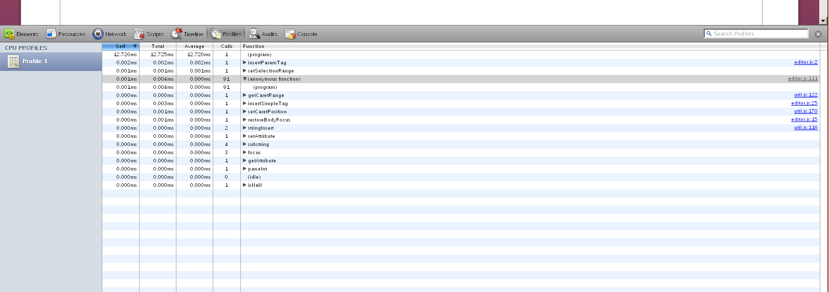
Yeah, the problem isn't the JavaScript, it's the CSS styling. Every keystroke appears to be invalidating the entire textarea and causing some re-paint issues.

I'll see if I can come up with anything to address it.
Edited by David Owens II
on

lM4RCU5l
Sub headings do not align correctly on mobile view.
Mmm, yeah. I need to do a few tweaks to the mobile view, I'll tackle that soon.
Edited by Andrew Chronister
on
The 'size' tag isn't working, at least in blog posts. Test. Also not in forum posts. Happens whether you type by hand or if you use the dropdown. At the moment this is embarassingly on the front page, but permalink.
(I only use the size tag because there's no equivalent to html 'h3'-ish things. Also there's no rule lines. But adding Markdown support will cover this.)
The markup language seems to turn carriage returns into 'br' tags, rather than using paragraph tags. This is bad because it makes the boundaries between sections like lists get too much space if you put an empty line before/after the list (see the link above for examples). So I think you should either suppress some of those br tags in those cases, or instead of figuring out the cases, just use paragraph tags and let html do the work for you.
Edited by Sean Barrett
on
Floxwoop
Compare resizing the window when on https://handmade.network/home to doing the same at http://mollyrocket.com/ and the problem should be obvious.
Casey did a lot of work to address this, including talking to browser people on twitter about what the fast path for this is. Ping him for details.
Also, having just this 10-post forum page open along with the link in my previous post utterly destroys performance on Windows Firefox (maybe only after a couple interactions, page-forward-backs or whatever), to the point where it's processing input only once every five-ten seconds (ie 0.1 fps).
Edited by Sean Barrett
on
ChronalDragon
- I can't upload new project logos for any theme.
Try refreshing the page after doing the upload. We still need to do the caching pass, so it might be serving up the old version of the settings page / project page.
I did try refreshing the site, but it's still the same. Do I have to scale the image to 400px*400px for the page to accept it?
ChronalDragon
- When I remove my optional real name, the project page doesn't list me as a developer.
I've just pushed an update which should hopefully fix this. Let me know if it's still broken (and send a screenshot).
It's fixed! Thanks! :)
ChronalDragon
Fixed by limiting image width to 100%. I think we might want to consider automatically giving large images links so that you can click to see the full thing, or wrapping them in a div so that a scrollbar can be added.
Also fixed! :)
By the way: Hierarchical quotes don't work. ;)
ChronalDragon
Thanks for the feedback!
Thanks for this site!
Edited by ands
on
ands
By the way: Hierarchical quotes don't work. ;)
I know. BBcode parsing is going to get a bit smarter soon. Should also fix @nothings observations about newlines.
Edit: [ ul ], [ ol ], and [ li ] now all eat an extra newline, which should help with keeping formatting consistent. Size now works.
Edited by Andrew Chronister
on
Hi, congrats for the launch !
2 problems:
- on the thread list in the handmade hero forum, if I try to go on a specific page that is less then the current page using the page number at the bottom, the link is wrong. E.g. going from page 38 to page 37 gives that link:
- I can't update a new profile image (it may be the same problem that ands, but not for a project logo), I was able to upload a first image but not change it after (no error message, it just doesn't do anything).
EDIT: After typing this message, the new profile image showed up in the forum, but not in the profile settings. I guess it needs some time.
2 problems:
- on the thread list in the handmade hero forum, if I try to go on a specific page that is less then the current page using the page number at the bottom, the link is wrong. E.g. going from page 38 to page 37 gives that link:
1 | https://hero.handmade.network/forums/code-discussion/('https://hero.handmade.network/forums/code-discussion/37',) |
- I can't update a new profile image (it may be the same problem that ands, but not for a project logo), I was able to upload a first image but not change it after (no error message, it just doesn't do anything).
EDIT: After typing this message, the new profile image showed up in the forum, but not in the profile settings. I guess it needs some time.
Edited by Simon Anciaux
on
Reason: Things change !
Hi ! Congrats for the launch. There's a lot of stuff that I like on the site, but also a few things that bother me. They are mostly design issues (especially with the forums). I'm not sure if you want brutally honest feedback (that will necessarily be biased), but if you do I'd be glad to share. (In the meantime I'ill be working on my own Stylish userscript to fix things, and I'll share it afterwards.)
Edited by TheEpsylon
on
Page URL: https://handmade.network/_settings#account
Description of issue: The account avatar image uploaded and was set nicely the first time, but when I tried to change it, on saving profile, the page reloads but doesn't update the avatar. I tried shift-F5, that didn't do anything. The file names of the 2 avatars were different. The page load seems to take slightly longer with a larger file, so it may be uploading...
Browser + version: Chrome Version 49.0.2623.112 m (64-bit)
Ascii Screenshot(s):
(Do I need to upload images somewhere else to link to them? Or can they just be uploaded here?)
After selecting an image:
After clicking SAVE PROFILE, and page loads, image below looks the same:
EDIT: Ok, the new avatar is up for this post, but not for my previous post or on my profile/profile update pages.
EDIT2: I edited my short bio, and that change was reflected everywhere I looked.
Description of issue: The account avatar image uploaded and was set nicely the first time, but when I tried to change it, on saving profile, the page reloads but doesn't update the avatar. I tried shift-F5, that didn't do anything. The file names of the 2 avatars were different. The page load seems to take slightly longer with a larger file, so it may be uploading...
Browser + version: Chrome Version 49.0.2623.112 m (64-bit)
Ascii Screenshot(s):
(Do I need to upload images somewhere else to link to them? Or can they just be uploaded here?)
After selecting an image:
1 2 3 | +-------------+
Avatar: | Choose File | NewImage.png
+-------------+
|
After clicking SAVE PROFILE, and page loads, image below looks the same:
1 2 3 | +-------------+
Avatar: | Choose File | No file chosen
+-------------+
|
EDIT: Ok, the new avatar is up for this post, but not for my previous post or on my profile/profile update pages.
EDIT2: I edited my short bio, and that change was reflected everywhere I looked.
Edited by Andrew Reece
on